The Summer Color We Can't Stop Using
There’s a reason pastel blue makes a return every summer.
Soft without being sweet.
Classic without feeling predictable.
It's the color of hydrangeas spilling over weathered garden walls. The striped umbrellas lining the coast. The early mornings by the water when everything feels calm, effortless, and just a little bit slower.
It's a color that immediately transports you somewhere.
And that's exactly why we love it.
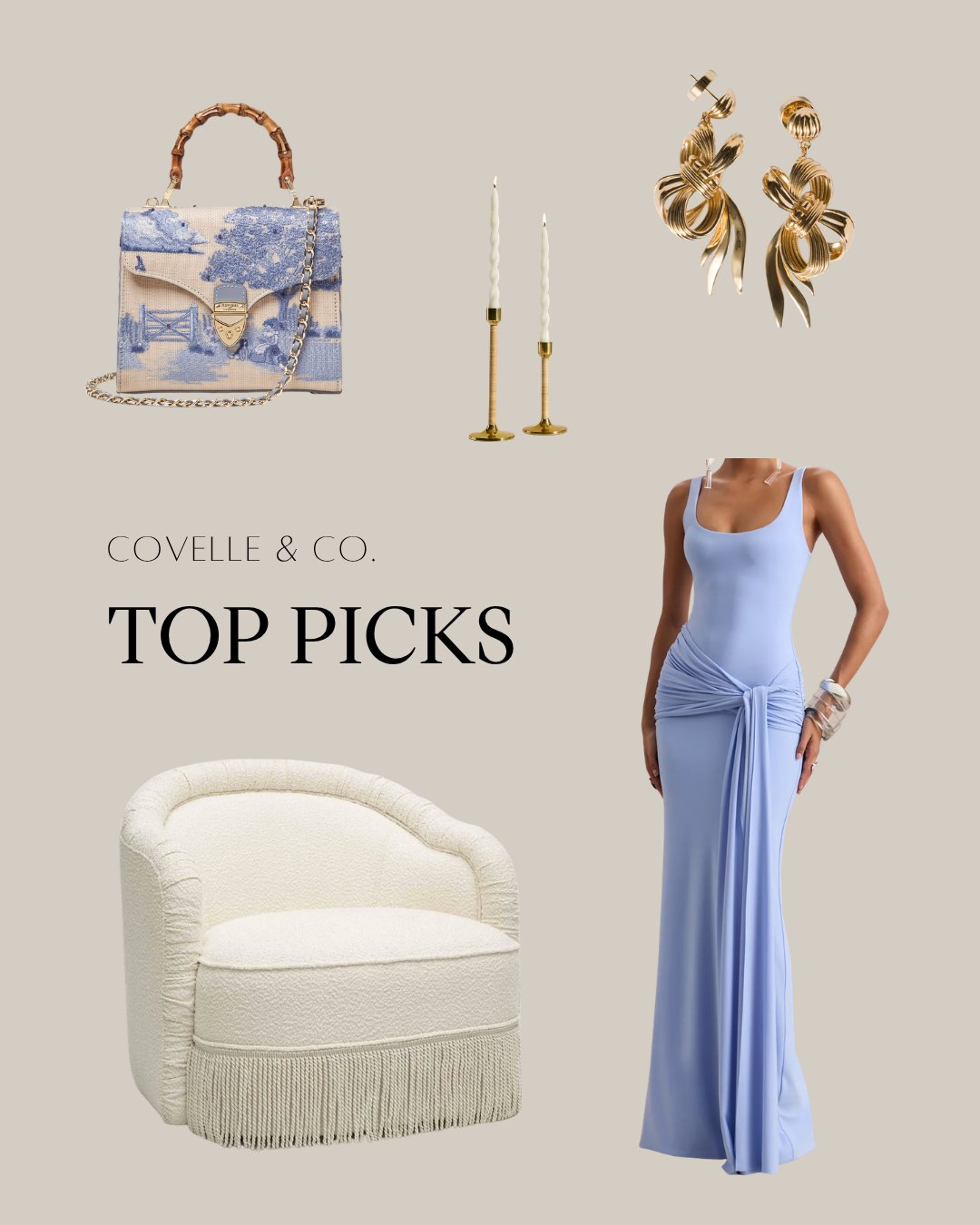
This month’s Covelle & Co. Top Picks are inspired by the shade we can't seem to stop gravitating toward: elegant pastel blues layered with warm neutrals, natural textures, and timeless pieces that feel equally fresh and enduring.
Because the best summer interiors don't scream for attention.
They simply make you want to stay a little longer.
Why Pastel Blue Continues to Feel Timeless
Unlike trend-driven colors that dominate for a season and quickly disappear, pastel blue has proven its staying power.
Its appeal comes from its versatility.
It can feel:
Coastal without becoming themed
Traditional without feeling dated
Contemporary without feeling cold
Relaxed without sacrificing sophistication
At Covelle & Co., we often describe pastel blue as a "living neutral."
It introduces color into a space while maintaining the calming, adaptable qualities homeowners typically seek from a neutral palette.
This balance makes it one of the easiest colors to incorporate into both interiors and personal style.
The New Coastal Palette
Today's coastal design looks very different than it did a decade ago.
The modern coastal aesthetic has evolved beyond overt nautical references and into something much more refined.
Instead of anchors and seashells, we're seeing:
Soft Blues
Inspired by ocean horizons and summer skies.
Warm Neutrals
Creams, ivories, sand tones, and natural linens.
Organic Textures
Rattan, woven materials, natural woods, and stone.
Layered Materials
A mix of soft fabrics, textured finishes, and collected accessories that create depth and warmth.
The result feels elevated rather than themed.
It's coastal living through a luxury lens.
How We Use Pastel Blue in Interior Design
One of the reasons pastel blue remains a designer favorite is its flexibility.
It can act as a subtle accent or become a defining element of a room.
Living Rooms
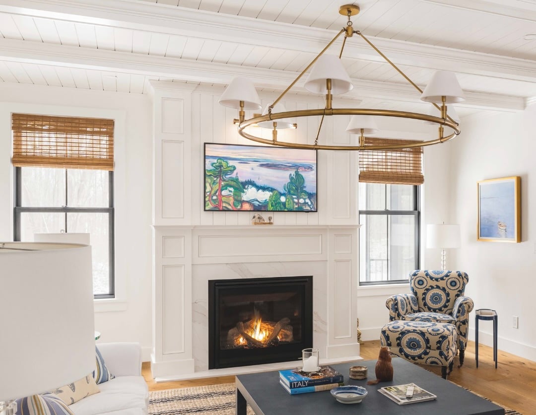
A pastel blue accent chair or patterned pillow can instantly brighten a neutral living space while maintaining sophistication.
Bedrooms
Blue naturally promotes a sense of calm, making it ideal for creating restful retreats.
Kitchens
Soft blue cabinetry or decorative accents can add personality without overwhelming the design.
Bathrooms
Blue feels particularly at home in bathrooms where its connection to water creates an effortless sense of serenity.
Whether used sparingly or throughout a room, the effect is always the same:
Fresh. Relaxed. Timeless.
Beyond Interiors: Why We Love Blue in Fashion Too
One of the reasons our Fashion Meets Interior and Top Picks series resonate so strongly is because the same design principles often apply to both spaces and wardrobes.
Pastel blue is a perfect example.
In fashion, it feels:
polished
approachable
elegant
effortless
The same is true in interiors.
A pastel blue handbag has the same energy as a beautifully upholstered accent chair.
A crisp blue linen shirt feels remarkably similar to a perfectly styled coastal bedroom.
It's all part of creating a cohesive lifestyle.
Because great style doesn't stop at your closet.
It extends into every space you inhabit.
Why Greater Boston Homeowners Love Coastal-Inspired Design
Throughout Cambridge, the North Shore, and Greater Boston, coastal-inspired interiors continue to be among the most requested design styles.
And for good reason.
They feel:
timeless
welcoming
sophisticated
connected to New England living
Even homeowners miles from the water are drawn to the sense of calm and ease that coastal palettes create.
Pastel blue plays a significant role in that feeling.
It introduces color without overwhelming a space and creates an atmosphere that feels light, airy, and inviting year-round.
Design That Feels Like Summer All Year Long
At Covelle & Co., we believe the most successful homes are the ones that evoke a feeling.
Not just a look.
Not just a trend.
A feeling.
Pastel blue works because it reminds us of some of life's most enjoyable moments:
A quiet morning coffee on the porch.
An afternoon by the water.
Fresh hydrangeas in bloom.
Golden light filtering through linen curtains.
These aren't just design choices.
They're emotional experiences.
And that's what great design is really about.
The Covelle & Co. Difference
Whether we're helping clients buy, sell, renovate, or design, our approach always starts with one question:
How do we want this space to feel?
Because the right colors, materials, and furnishings don't simply decorate a room.
They shape the experience of living there.
That's why our team combines expertise in real estate, interior design, and development to help clients create homes that are both beautiful and valuable.
It's our philosophy:
Design. Build. Sell.
Ready to Bring More Blue Into Your Home?
Save this for your next design refresh.
Share it with someone who loves a timeless coastal palette.
Follow us on Instagram @covelle_co for weekly design inspiration, curated finds, and lifestyle content.
And if you're ready to transform your space, schedule your complimentary consultation with Covelle & Co.
Let's create a home that feels as timeless and refreshing as summer itself.