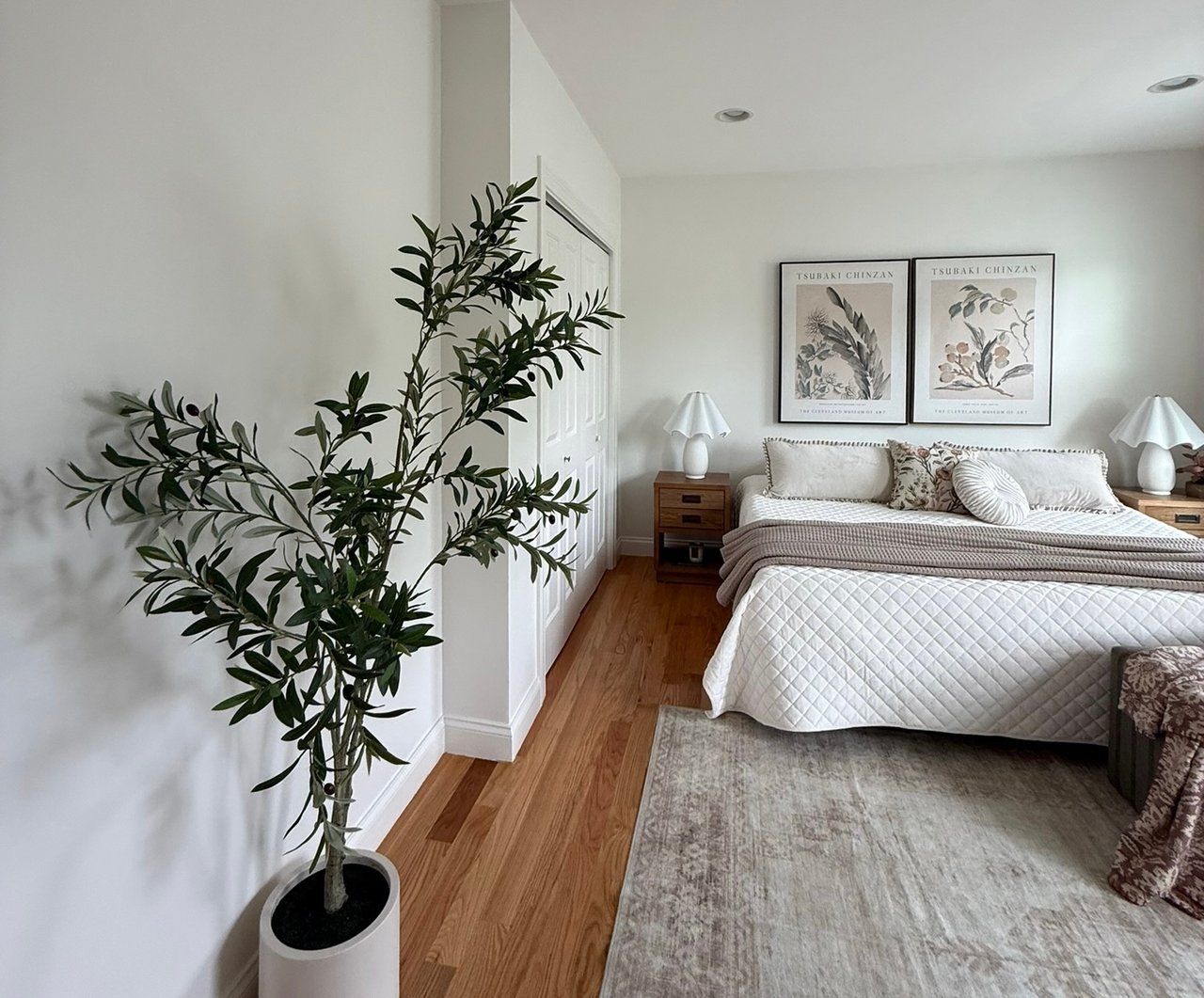
October Is Calling, and We're Answering in Chocolate Brown
October has a way of changing everything.
The light gets warmer. The air gets cooler. Layers come back out. And suddenly, the colors we want to surround ourselves with shift from summer's lighter palette toward something richer, warmer, and a little moodier.
This year, we're answering that shift in chocolate brown.
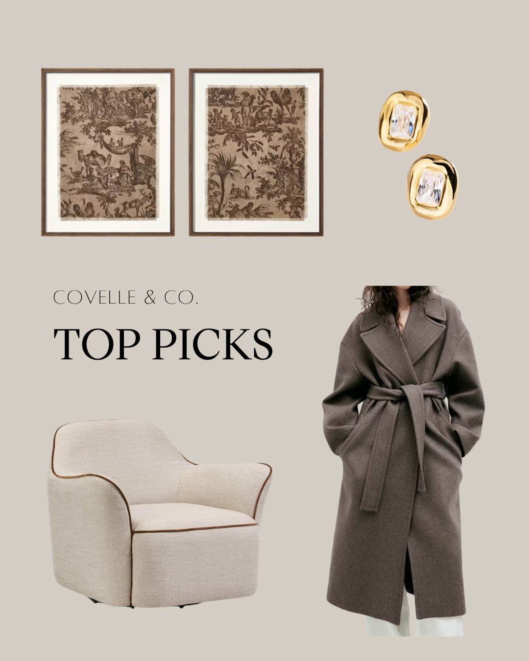
For our October Covelle & Co. Top Picks, we're leaning into everything we love about fall: deep chocolate tones, creamy neutrals, plush texture, effortless layers, and just the right touch of gold.
And we're taking that inspiration beyond the home.
Because one of the things we've always believed at Covelle & Co. is that fashion and interiors speak the same language.
The colors you're drawn to in your closet often find their way into your home. The textures that make an outfit feel layered can do the same thing for a room. And whether we're putting together an outfit or designing an interior, proportion, contrast, texture, and personality are what make the final result feel complete.
This month's edit brings those worlds together.
A chocolate brown wrap trench from Mango sets the tone.
A plush, textural side chair from Four Hands translates that warmth directly into the home.
Cream and brown artwork from Studio McGee at Target creates a soft, tonal backdrop.
And gold diamond earrings from Anthropologie add the little bit of sparkle every great neutral palette needs.
Fashion meets interiors. Fall edition.
And we are very much here for it.
Why Chocolate Brown Is Having a Major Interior Design Moment
For years, cool grays dominated interiors.
Then came the return of warmer whites, creams, natural wood, taupe, camel, and beige.
Chocolate brown feels like the natural next step.
It has the depth of black but feels softer.
It has the warmth of beige but creates more contrast.
And when paired with cream, ivory, natural wood, stone, or brass, it can feel incredibly sophisticated.
Chocolate brown can also play several roles within a room.
It can be the statement.
It can be the grounding neutral.
Or it can simply appear in smaller doses to give a lighter palette more dimension.
That versatility is exactly why we love it.
This isn't brown for the sake of following a trend.
It's a classic neutral being looked at through a new lens.
The Mango Chocolate Brown Wrap Trench Sets the Mood
Let's start with the piece that inspired the palette.
The chocolate brown wrap trench from Mango captures exactly what we love about fall style.
It's effortless.
It's layered.
It's sophisticated without feeling overdone.
And most importantly, the color does a lot of the work.
Chocolate brown brings depth to even the simplest outfit. Pair it with denim and a white shirt, layer it over a monochromatic cream look, or combine it with black for something moodier.
The silhouette may be classic, but the color makes it feel current.
And that is exactly how we like to approach interiors.
A room does not need to be filled with trendy furniture to feel fresh.
Sometimes changing one color, finish, or material is enough to shift the entire mood.
From Trench Coat to Side Chair: Translating Fashion Into Interiors
Now take everything we love about that coat and imagine it as a room.
Warmth.
Texture.
Depth.
Comfort.
Enter the Four Hands side chair.
A richly textured chocolate-toned chair can instantly anchor a lighter room.
Place it against creamy walls.
Pair it with a warm ivory sofa.
Add a light neutral rug underneath.
Suddenly, the brown becomes the visual weight that holds everything together.
This is one of the easiest ways to experiment with a deeper color without committing to an entire room.
You don't need chocolate brown walls.
You don't need a brown sofa.
You need one strategically chosen piece that creates enough contrast to change the feeling of the space.
That's what a great accent chair can do.
Texture Is What Makes a Neutral Palette Interesting
When you're designing with a limited color palette, texture becomes incredibly important.
Imagine a room containing a brown chair, brown rug, brown table, and brown accessories all in similar finishes.
Even if each piece is beautiful, the room can quickly feel flat.
Now imagine the same palette with:
Plush upholstery
Natural wood
Linen
Soft wool
Aged brass
Smooth stone
Textured artwork
Matte ceramics
Suddenly, the room has depth.
This is why neutral interiors are often much more complex than they appear.
When color is quieter, the other design elements have to work harder.
Texture becomes pattern.
Shape becomes decoration.
Material becomes contrast.
And that is where sophisticated neutral design really begins.
Studio McGee Artwork: Bringing Cream and Brown Together
The cream and brown Studio McGee artwork from Target is the bridge within this month's collection.
It connects the richness of chocolate brown with the softness of cream, creating a palette that feels warm without becoming heavy.
Artwork is one of our favorite ways to establish a room's color story because it can quietly introduce several tones at once.
Instead of matching every piece of furniture to the artwork, pull individual colors from it.
A brown accent chair.
A cream sofa.
A warm wood table.
A touch of black.
A little gold.
Now the room feels connected without feeling overly coordinated.
That's an important distinction.
We never want a space to feel as though every piece came from the same collection.
We want it to feel curated.
High-Low Design: Because Great Style Isn't About the Price Tag
We also love that this month's collection combines pieces from different price points.
A Four Hands chair can sit beautifully beneath artwork from Target.
Just as a designer handbag can work with a great pair of jeans, interiors benefit from the same high-low approach.
Luxury is not about making sure everything in a room is expensive.
It is about knowing where to invest.
Maybe the chair is your investment piece because it needs to be comfortable, durable, and visually impactful.
The artwork may be where you save.
Then perhaps you invest again in lighting or a rug that will remain in the room for years.
This balance creates spaces that feel personal rather than precious.
And more importantly, it allows you to direct your budget toward the things that truly matter.
Gold Is the Jewelry of a Room
No fall look is complete without a little gold.
This month's Anthropologie gold diamond earrings are technically our fashion pick, but the reason they work within the collection is the same reason we love brass and gold in interiors.
Gold brings light to a warm palette.
Chocolate brown and cream can be soft and sophisticated on their own, but a small metallic element adds polish.
Think of gold accents in your home the same way you think about jewelry.
You don't need them everywhere.
A little goes a long way.
Try:
A brass lamp
Gold picture frames
Cabinet hardware
A sculptural tray
A mirror
A small side table
Decorative objects
The goal isn't to make the room feel "gold."
The goal is to give the eye a little moment of shine.
Chocolate Brown + Cream Might Be Fall's Best Color Combination
If chocolate brown feels intimidating, pair it with cream.
The contrast is strong enough to feel intentional but soft enough to remain inviting.
Cream prevents brown from feeling too dark.
Brown prevents cream from feeling too delicate.
Together, they create the balance we're constantly looking for in interiors.
For fall, consider a palette of:
Chocolate Brown + Cream + Warm Wood + Black + Gold
It feels seasonal without relying on traditional fall colors.
No orange required.
No room full of pumpkins necessary.
Instead, the season comes through in warmth, texture, depth, and mood.
And because the palette isn't overtly seasonal, it continues to work beautifully through winter and beyond.
How to Bring Chocolate Brown Into Your Home Without Redesigning Everything
One of the best things about this trend is that you don't need a major renovation to embrace it.
Start with one element.
Try an Accent Chair
A brown upholstered chair adds instant depth to a cream or neutral living room.
Introduce Brown Through Textiles
Pillows, throws, bedding, or a rug can shift the palette without requiring a large investment.
Bring in Darker Wood
A walnut side table, console, or vintage furniture piece introduces brown naturally.
Use Artwork to Connect the Palette
Look for artwork that combines cream, brown, black, and warm neutral tones.
Add Brass or Gold
A small amount of metallic warmth will keep deeper neutrals from feeling too heavy.
Don't Forget Black
A touch of black gives the entire palette definition and makes chocolate brown feel more sophisticated.
You don't need all of these at once.
Start with one or two and see how the room changes.
Why Fall Doesn't Have to Mean "Fall Décor"
We're always drawn to seasonal design that changes the feeling of a home rather than filling it with obvious seasonal decorations.
You don't necessarily need more décor.
You may just need different layers.
Swap a lightweight summer throw for a heavier textured one.
Replace a pale pillow with chocolate velvet.
Bring in a darker piece of artwork.
Change the branches or greenery on your dining table.
Turn on the lamps a little earlier.
Layer a warmer rug.
Small changes can create a seasonal shift without making your home feel themed.
The result is more timeless, and often more sophisticated.
Fashion Meets Interiors
Fashion and interior design have always influenced each other.
Think about the words we use to describe both:
Classic.
Layered.
Tailored.
Textured.
Minimal.
Bold.
Timeless.
Statement.
Collected.
The principles are remarkably similar.
A great outfit needs proportion.
So does a room.
A monochromatic outfit becomes more interesting through texture.
So does a neutral interior.
Jewelry finishes an outfit.
Lighting and hardware finish a room.
And in both cases, personality is what prevents the final result from feeling generic.
That's why our Covelle & Co. Top Picks will always blur the line between what we're wearing and what we're putting in our homes.
Style doesn't stop at the closet door.
Why Warm Neutrals Work Beautifully in Greater Boston Homes
Chocolate brown and cream also happen to work beautifully with the architecture we see throughout Greater Boston, Stoneham, Cambridge, Somerville, and the North Shore.
Many New England homes already contain warm foundational elements:
Hardwood floors.
Brick fireplaces.
Natural stone.
Historic millwork.
Traditional cabinetry.
Older wood details.
Instead of fighting against those materials, warm neutrals can make them feel intentional again.
A chocolate chair can pick up the tones of an original hardwood floor.
Cream walls can brighten historic millwork.
Brass can complement older architectural details while still feeling fresh.
This is especially useful when updating an older home.
Not everything needs to be ripped out to make a space feel current.
Sometimes the better approach is to understand what is already working—and design around it.
Great Design Can Matter When It's Time to Sell, Too
Our perspective at Covelle & Co. is a little different because we don't look at design in isolation.
We're also looking through the lens of real estate.
How will this room photograph?
What will buyers notice first?
Does the space feel current without feeling trendy?
Are we highlighting the home's strongest architectural features?
Does the design help buyers understand the lifestyle the property offers?
Thoughtful design can influence all of those things.
That doesn't mean designing solely for resale.
It means recognizing that the decisions you make in your home today can affect how someone experiences it tomorrow.
And when it is time to sell, sometimes a few thoughtful updates, new lighting, better furniture placement, updated paint, stronger styling, or a more cohesive palette, can dramatically change the presentation of a property.
That's the advantage of approaching real estate through a design lens.
Design. Build. Sell. It's All Connected.
Whether we're selecting a side chair, designing a renovation, helping a client prepare a home for market, or positioning a listing to stand out, we are always thinking about the complete picture.
How does it look?
How does it function?
How does it feel?
And how does it affect value?
That's why Design. Build. Sell. isn't simply a tagline for us.
It's how we see home.
A beautifully designed space improves the way you live in it.
A thoughtfully planned renovation can improve functionality and value.
And strategic presentation can completely change how buyers experience a property when it's time to sell.
Each piece informs the next.
October's Final Edit
So, what are we bringing into October?
Chocolate brown.
Cream.
Texture.
A little gold.
And pieces with enough personality to make even the simplest palette feel special.
The Mango wrap trench sets the tone.
The Four Hands chair brings it home.
The Studio McGee artwork connects the palette.
And the Anthropologie earrings remind us that sometimes all you need is the right finishing touch.
Because great style doesn't stop at your closet, or your front door.
The best spaces, just like the best outfits, come down to color, texture, proportion, and personality.
Fashion meets interiors. Fall edition.
Save this month's Covelle & Co. Top Picks for your fall mood board and send it to someone who loves a good chocolate-brown moment.
Then tell us: Which October Top Pick are you bringing home?
Follow @covelle_company on Instagram for our monthly Top Picks, Covelle & Co. Collections, Looks for Less, interior design inspiration, real estate insights, and behind-the-scenes looks at our latest projects.
And if fall has you ready to finally tackle that room you've been thinking about, schedule your complimentary consultation with Covelle & Co.
Whether we're refreshing a room, renovating a home, or preparing a property for market, we're here to help you make thoughtful decisions that look beautiful and make sense.
Design. Build. Sell.